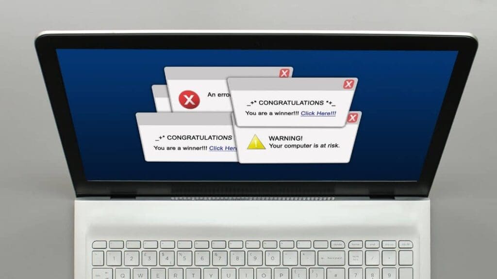
Pop-ups in digital marketing can be a double-edged sword with advantages and disadvantages. On the positive side, pop-ups are incredibly effective in grabbing users’ attention. Their intrusive nature ensures visibility, allowing marketers to swiftly convey essential messages, promote offers, or capture leads.
These pop-ups can significantly increase conversions and drive engagement, especially when strategically timed or tailored to user behaviour. They offer a quick way to direct visitors’ focus to a specific call-to-action, such as subscribing to a newsletter, accessing a discount, or guiding them to relevant content.
However, the use of pop-ups also comes with notable drawbacks. Their intrusive nature can lead to a negative user experience, interrupting the browsing flow and annoying. This can result in users actively avoiding or even leaving a website altogether. Moreover, certain pop-ups, especially those poorly designed or overly aggressive, might appear spammy or untrustworthy, tarnishing the brand’s image and credibility. Additionally, many users actively block pop-ups with the rise of ad blockers, reducing their effectiveness and reach.

Striking the right balance is crucial. Utilizing less intrusive, well-timed, and relevant pop-ups can capitalize on their effectiveness while minimizing user irritation. A thoughtful approach that considers user experience, relevance, and frequency can help mitigate the negatives and leverage the positives of pop-ups in digital marketing.
For these many reasons, any pop-ups since then have received a lot of criticism from consumers. However, when used effectively, pop-ups are a way to strengthen your digital marketing efforts with an average conversion rate of between 2% and 3%.
Pop-ups No-Go’s
Before getting into which pop-ups you should be using and how we wanted to cover a few things you must avoid when creating them.
- Having multiple pop-ups on a short page
- Giving irrelevant offers
- Being too wordy
- Asking for too many details when applying for an offer
- Hiding the close button
- Using auto-play videos
Pop-ups in digital marketing have long been debated due to their polarizing nature. Their advantages in garnering attention and driving conversions are undeniable, yet their intrusive characteristics often lead to negative user experiences and potential drawbacks.
User Experience Impact: The invasive nature of pop-ups can disrupt the browsing flow, causing irritation and potentially driving users away from a website. Annoyance arises when pop-ups obstruct the content users are trying to access, resulting in a subpar experience. This negative encounter might even lead users to install ad blockers to avoid such interruptions.
Trust and Brand Image: Poorly designed or overly aggressive pop-ups can seem spammy or untrustworthy, tarnishing a brand’s credibility. Annoying pop-ups create a disconnect between the brand and the user, affecting the company’s perception and potentially losing trust.
Adaptation to User Behavior: The key lies in employing less intrusive and more contextually relevant pop-ups. Timely pop-ups triggered by specific user behaviours, such as exit intent or scrolling depth, can increase relevance and reduce perceived intrusiveness. Tailoring offers and messages to align with user interests and needs is crucial for positive reception.
Types of Effective Pop-ups for Digital Marketing
You must know which kinds work to use pop-ups effectively in your digital marketing strategy. If you can use one of the options below with a strong copy and an exciting offer shown at the right time, you’re set!
Exit Pop-ups
This is an effective pop-up when a potential customer is interested in your offering but is not yet ready to purchase.
These are generally big text boxes that pop up with the background blurred or darkened. The offer must be strong enough to keep someone ready to leave your site interested. Newsletter signups, discount codes (especially first-time customer discounts) and free trials work very well as offers.
Click Pop-ups
This is one of the least intrusive pop-ups. You can showcase your products and go into detail without making it feel like a pop-up. Someone has to click on a product they are interested in, and then additional information will pop up (i.e., a tutorial video) on that specific product. Since they’ve already shown interest in learning more about the product, the pop-up has a strong conversion rate when it does appear.
* The pop-up must be about the product they’re looking at for this to work.
Opt-in Bars
These can drive a lot of attention to your offers as they are easily seen and not as intrusive. The benefit of using opt-in bars is that they can remain on the users’ screen as they scroll. Adding a countdown timer creates a sense of urgency, increasing the conversion rate. Deals and offers that work best for this are active contests, ongoing offers and newsletter sign-ups.
* Do not use this if you must include a lot of copy.
Interactive Pop-up
The most famous example would be a wheel that you can “spin” to win a reward (discount, free shipping, etc.) The spin only happens after the requested information has been filled out.
Another bonus is that you don’t have to worry about how much free stuff you may need to give away. You can adjust the percentages for different prizes to control what is won.
Not all pop-ups are cringe-worthy. Knowing what you’re doing can elevate your digital marketing game and increase revenue. It all comes down to whether or not the offer is relevant and the pop-up is well-designed with good copy. Remember that a tiny mistake can ruin a user’s experience, so if you’re unsure how to create effective pop-ups, get in touch with us for some help!


